The WJSmisc package is set of functions I find convenient to have readily available to me.
Installation
You can install the development version from GitHub with:
# install.packages("remotes")
remotes::install_github("wjschne/WJSmisc")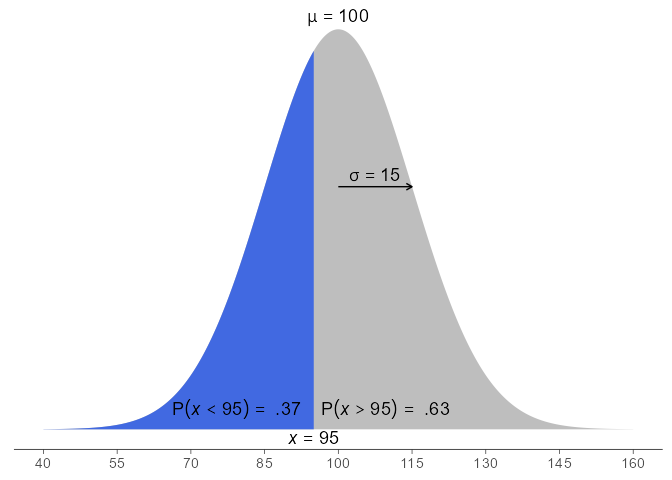
Correlation heat maps
library(simstandard)
model <- "
A =~ 0.71 * A_1 + 0.91 * A_2 + 0.85 * A_3
B =~ 0.65 * B_1 + 0.90 * B_2 + 0.75 * B_3
A ~~ -0.2 * B
"

d <- sim_standardized(
  model,
  latent = FALSE,
  error = FALSE)

cor_heat(d, margins = 0.1)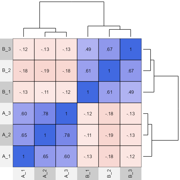
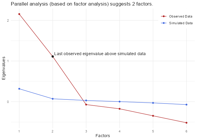
Factor Analysis Loading Plot
psych::fa(d, nfactors = 2, fm = "pa") %>%
  plot_loading(factor_names = c("A", "B"))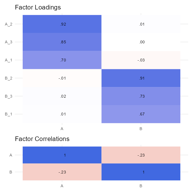
Composite covariance
# Create covariance matrix
Sigma <- matrix(0.6, nrow = 5, ncol = 5)
diag(Sigma) <- 1

# Create weight matrix
w <- matrix(0, nrow = 5, ncol = 2)
w[1:2,1] <- 1
w[3:5,2] <- 1
w
#>      [,1] [,2]
#> [1,]    1    0
#> [2,]    1    0
#> [3,]    0    1
#> [4,]    0    1
#> [5,]    0    1

# covariance of weighted sums
composite_covariance(Sigma, w)
#>      [,1] [,2]
#> [1,]  3.2  3.6
#> [2,]  3.6  6.6
Correlation Ellipse
cor_ellipse(0.75) %>%
  ggplot(aes(x,y)) +
  geom_polygon(alpha = 0.5) +
  coord_fixed()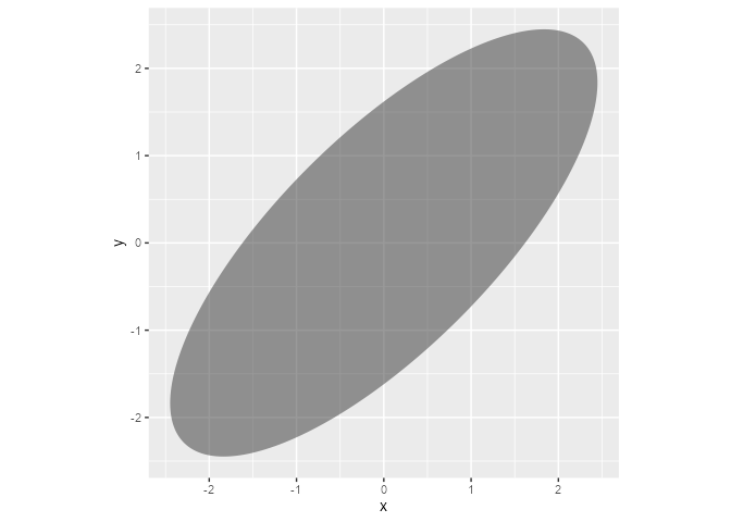
Split at x = 1
cor_ellipse(0.75, split_x = 1) %>%
  ggplot(aes(x,y)) +
  geom_polygon(aes(fill = group), alpha = 0.5) +
  coord_fixed()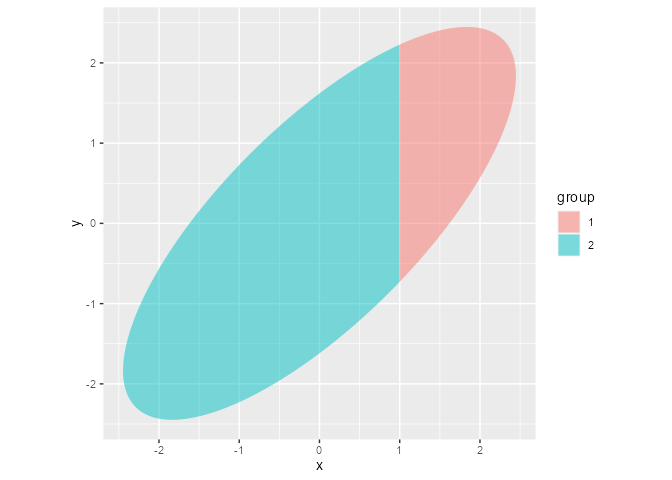
Split at x = 1 and y = 0
cor_ellipse(0.75, split_x = 1, split_y = 0) %>%
  ggplot(aes(x,y)) +
  geom_polygon(aes(fill = group), alpha = 0.5) +
  coord_fixed()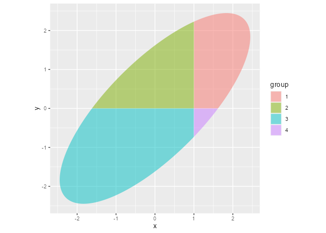
Every combination of 2 or more vectors
cross_vectors(c("a", "b"),
              c("x", "y"),
              c(1,2),
              sep = "_")
#> [1] "a_x_1" "a_x_2" "a_y_1" "a_y_2" "b_x_1" "b_x_2" "b_y_1" "b_y_2"
z-score
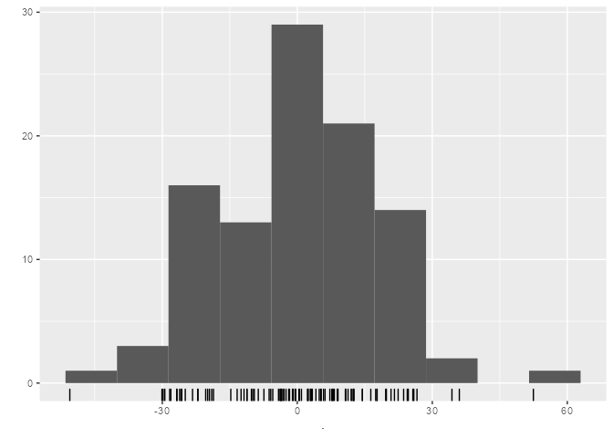
Like the scale function except that it returns a plain vector instead of a matrix with attributes. It can also return z-scores based on a user-specified means and standard deviations.
x <- rnorm(100, mean = 100, sd = 15)

# z-score with sample mean and sample sd
x2z(x) %>%
  qplot(bins = 10) +
  geom_rug()
# z-score with user-specified population mean and sd
x2z(x, mu = 100, sigma = 15) %>%
  qplot(bins = 10) +
  geom_rug()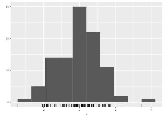
Attach function argument defaults to global environment
When debugging a function with many default arguments, it is useful to assign the default values to the variables in the global environment.
my_function <- function(x = 1, y = 2) {x + y}
attach_function(my_function)
x
#> [1] 1
y
#> [1] 2
Convert an angle to ggplot2 hjust and vjust parameters
Control placement of labels with the angular position by converting an angle to hjust and vjust parameters.
tibble(degrees = seq(0, 345, 15),
       radians = degrees * pi / 180,
       x = cos(radians),
       y = sin(radians),
       hjust = angle2hjust(radians),
       vjust = angle2vjust(radians)) %>%
  ggplot(aes(x, y)) +
  geom_segment(aes(x = 0, y = 0, xend = x, yend = y), size = .1) +
  geom_label(aes(label = degrees,
                 hjust = hjust,
                 vjust = vjust),
             label.padding = unit(1, "mm"),
             label.size = 0) +
  geom_point() +
  coord_fixed(1, clip = "off") +
  theme_void()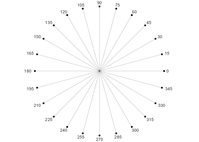
I use these functions to make sure that labels on a curve are perpendicular to the curve:
# Small change in x
dx <- .000001
plot_ratio <- 16
tibble(x = seq(-4,4),
       y = dnorm(x),
       l = WJSmisc::prob_label(pnorm(x), digits = 2),
       slope = plot_ratio * (dnorm(x + dx) - y) / dx,
       angle = atan(slope) + pi / 2,
       hjust = angle2hjust(angle),
       vjust = angle2vjust(angle)) %>%
ggplot(aes(x, y, label = l)) +
  geom_point() +
  stat_function(fun = dnorm) +
  geom_label(aes(hjust = hjust,
                 vjust = vjust),
             label.size = 0) +
  coord_fixed(plot_ratio, clip = "off") +
  theme_minimal()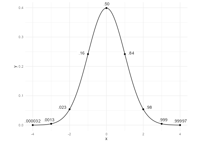
Formatting probability values
Probabilities near 0 and 1 are rounded differently.
p <- c(0,.0012, .025, .5, .99, .994, .99952, 1)
prob_label(p, digits = 2)
#> [1] "0"     ".0012" ".025"  ".50"   ".99"   ".994"  ".9995" "1"
prob_label(p, accuracy = .01)
#> [1] "0"    ".00"  ".02"  ".50"  ".99"  ".99"  "1.00" "1"

proportion_round(p)
#> [1] 0.0000 0.0010 0.0300 0.5000 0.9900 0.9940 0.9995 1.0000
proportion2percentile(p, add_percent_character = TRUE)
#> [1] "%"      ".1%"    "3%"     "50%"    "99%"    "99.4%"  "99.95%" "100%"
Sizing text in ggplot2
Text size in geom_text and geom_label does not use the same units as the rest of ggplot2.
I use the ggtext_size function so that text from geom_text will be the same size as the axis labels.
mytextsize <- 24
tibble(x = 1:5, y = x) %>%
  ggplot(aes(x, y)) +
  geom_text(aes(label = x), size = ggtext_size(mytextsize)) +
  theme_gray(base_size = mytextsize) +
  coord_equal()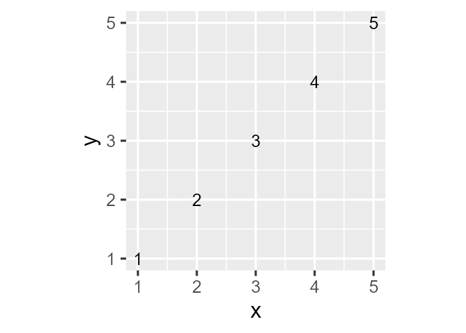
Random beta distributions with specific means and standard deviations.
Sometimes I need random variables with values between 0 and 1. To get a beta distribution that I want, there is less trial-and-error if I specify the mean and standard deviation rather than 2 shape parameters. Note that not all combinations of means and standard deviations are possible.
rbeta_ms(10000, .7, .1) %>%
  qplot(bins = 30) +
  coord_cartesian(xlim = c(0, 1))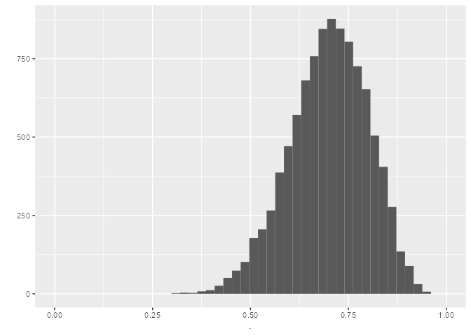
Formatting numeric values
R has great formatting functions like format and formatC. I find scales::number to be particularly useful. However, I often have particular preferences that I do not want to keep specifying every time I need to format a number.
Remove leading zeroes
For numbers between -1 and 1, leading zeroes are removed.
remove_leading_zero(c(-2, -0.051, 0.05, 2))
#> [1] "-2.00" "-.05"  ".05"   "2.00"
Formatting probabilities
The prob_label function formats probabilities according to my preferences:
- 0 is
0unlessround_zero_oneisFALSE. - 1 is
1unlessround_zero_oneisFALSE. - Other probabilities are rounded to the nearest .01 with the leading removed.
prob_label(seq(0,1,0.2))
#> [1] "0"   ".20" ".40" ".60" ".80" "1"
Setting the digits argument to 2 will round to 2 significant digits with the exception that probabilities near 1 are rounded to the first number that is not 9.
prob_label(c(.00122, .0122, .122, .99112, .999112), digits = 2)
#> [1] ".0012" ".012"  ".12"   ".991"  ".9991"
The proportion_round rounds .
proportion_round(c(0,.0011,.5,.991, .99991, 1))
#> [1] 0.00000 0.00100 0.50000 0.99100 0.99991 1.00000
Formatting percentiles
I like to round percentiles to nearest integer unless they are close to 0 or 100.
tibble(z_scores = -4:4,
       proportions = pnorm(z_scores),
       percentiles = proportion2percentile(proportions,
                                           add_percent_character = TRUE)
       )
#> # A tibble: 9 x 3
#>   z_scores proportions percentiles
#>      <int>       <dbl> <chr>
#> 1       -4   0.0000317 .003%
#> 2       -3   0.00135   .1%
#> 3       -2   0.0228    2%
#> 4       -1   0.159     16%
#> 5        0   0.5       50%
#> 6        1   0.841     84%
#> 7        2   0.977     98%
#> 8        3   0.999     99.9%
#> 9        4   1.00      99.997%
Formatting correlations
I like to round correlations to the nearest .01 with leading zeroes removed. The diagonals are just 1s.
tri2cor(c(.4,.5,.66544)) %>%
  cor_text()
#>      [,1]  [,2]  [,3]
#> [1,] "1"   ".40" ".50"
#> [2,] ".40" "1"   ".67"
#> [3,] ".50" ".67" "1"
If any correlation in the matrix is negative, the positive correlations get a leading space (to make the correlations easier to align in a plot or table).