
library(tidyverse)
myfont <- "Roboto Condensed"

d <- tibble(Group = LETTERS[1:26],
            mu = rnorm(26, 0, .5),
            sigma = 1) %>%
  mutate(x = pmap(list(mean = mu, sd = sigma), rnorm, n = 500)) %>%
  unnest(x) %>%
  mutate(Agree = cut_number(x, 6) %>%
           factor(
             labels = c(
               "Strongly\nDisagree",
               "Disagree",
               "Slightly\nDisagree",
               "Slightly\nAgree",
               "Agree",
               "Strongly\nAgree"
             )
           )) %>%
  group_by(Group, Agree) %>%
  summarise(n = n(), .groups = "drop") %>%
  group_by(Group) %>%
  arrange(Group, Agree) %>%
  mutate(p = n / sum(n)) %>%
ungroup()Setup
This trick takes a lot of work. I only use it when I need a plot to look its best.
Suppose I have a Likert questionnaire item with responses ranging from Strongly Disagree to Strongly Agree. Let’s say I have many groups in my study (e.g., college majors), and I want to compare their responses to the item.
First I will create fake data for 26 groups, A–Z.
First Attempts at Plotting
d %>%
  ggplot(mapping = aes(p, Group)) +
  geom_col(aes(fill = fct_rev(Agree))) +
  scale_fill_viridis_d(NULL,
                       begin = .15,
                       end = 0.8,
                       direction = -1) +
  scale_x_continuous("Percent", expand = expansion()) +
  scale_y_discrete("Group", expand = expansion()) +
  coord_fixed(1 / 20.5, clip = "off") +
  geom_text(
    aes(x = p, label = round(100 * p, 0)),
    color = "white",
    family = myfont,
    position = position_stack(vjust = .5)
  )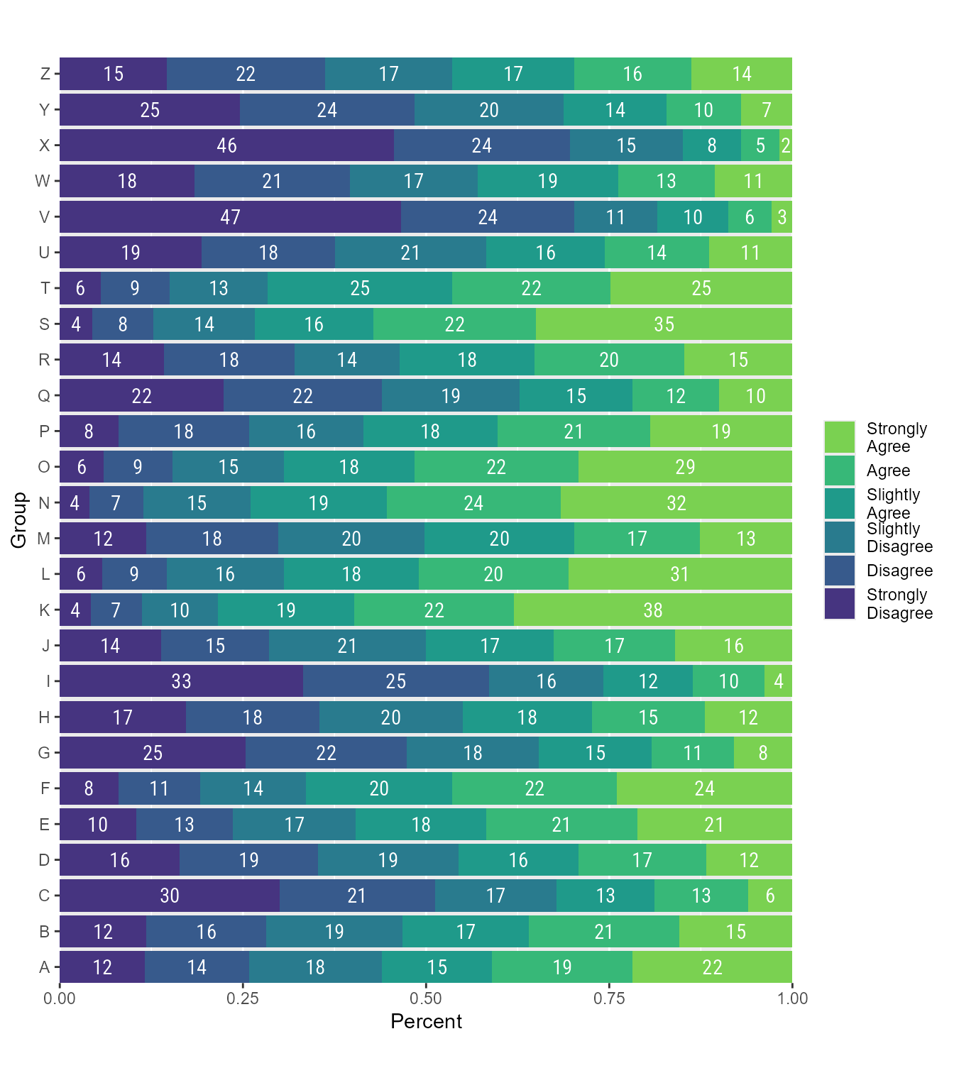
Not bad, but it would look better if we sorted the groups. We have many sorting options. One is that we can convert the Likert scale to numeric and then sort by the group with the highest mean.
d %>%
  mutate(Group = fct_reorder(Group, .x = as.numeric(Agree) * p,
                             .fun = mean)) %>%
  ggplot(mapping = aes(p, Group)) +
  geom_col(aes(fill = fct_rev(Agree))) +
  scale_fill_viridis_d(NULL,
                       begin = .15,
                       end = 0.8,
                       direction = -1) +
  scale_x_continuous("Percent", expand = expansion()) +
  scale_y_discrete("Group", expand = expansion()) +
  coord_fixed(1 / 20.5, clip = "off") +
  geom_text(
    aes(x = p, label = round(100 * p, 0)),
    color = "white",
    family = myfont,
    position = position_stack(vjust = .5)
  )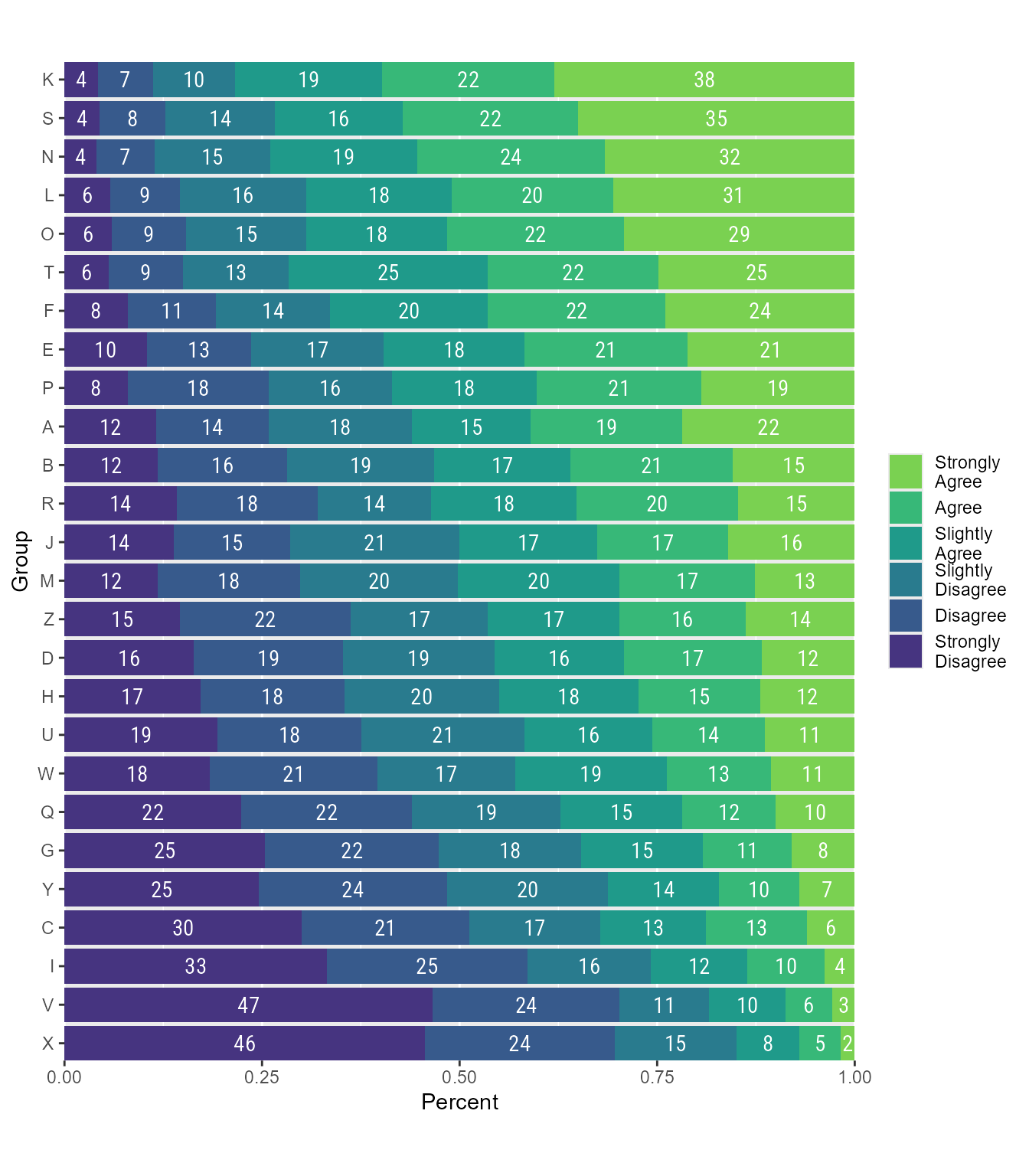
If I wanted to sort by the “Strongly Agree” category (or any other category):
d %>%
  mutate(Group = fct_reorder(
    Group,
    .x = (Agree == "Strongly\nAgree") * p,
    .fun = mean
  )) %>%
  ggplot(mapping = aes(p, Group)) +
  geom_col(aes(fill = fct_rev(Agree))) +
  scale_fill_viridis_d(NULL,
                       begin = .15,
                       end = 0.8,
                       direction = -1) +
  scale_x_continuous("Percent", expand = expansion()) +
  scale_y_discrete("Group", expand = expansion()) +
  coord_fixed(1 / 20.5, clip = "off") +
  geom_text(
    aes(x = p, label = round(100 * p, 0)),
    color = "white",
    family = myfont,
    position = position_stack(vjust = .5)
  )
Final Plot
So far, these plots look pretty good. However, I wish that the percentage labels were placed in a more aesthetically pleasing way. I am going to group by each of the response categories and then create a loess regression equation to smooth out the placement. It will mean that the labels are no longer centered in the stacked bars, but I think the sacrifice is worth it. I think that the percentage values are much easier to compare because the eye can follow the smooth line of labels.
d <- tibble(Group = LETTERS[1:26],
            mu = rnorm(26, 0, .5),
            sigma = 1) %>%
  mutate(x = pmap(list(mean = mu, sd = sigma), rnorm, n = 500)) %>%
  unnest(x) %>%
  mutate(Agree = cut_number(x, 6) %>%
           factor(
             labels = c(
               "Strongly\nDisagree",
               "Disagree",
               "Slightly\nDisagree",
               "Slightly\nAgree",
               "Agree",
               "Strongly\nAgree"
             )
           )) %>%
  mutate(Group = fct_reorder(Group, as.numeric(Agree), .fun = mean)) %>%
  group_by(Group, Agree) %>%
  summarise(n = n(), .groups = "drop") %>%
  mutate(Group_position = as.numeric(Group)) %>%
  group_by(Group) %>%
  arrange(Group, Agree) %>%
  mutate(p = n / sum(n),
         # proportion in each response category by group
         cp = cumsum(p),
         # cumulative proportion
         xpos = cp - p / 2 # center of each stacked bar
         ) %>%
         group_by(Agree) %>%
           nest() %>%
           mutate(
             fit = map(data,
                       loess,
                       formula = "xpos ~ Group_position",
                       span = 0.45),
             # loess regression for each response category
             xhat = map(fit, predict) # x-axis position on smooth line
           ) %>%
           select(-fit) %>%
           unnest(c(data, xhat)) %>%
           mutate(Group = factor(Group, labels = rev(LETTERS[1:26])))

         d %>%
           ggplot(mapping = aes(p, Group)) +
           geom_col(aes(fill = fct_rev(Agree))) +
           geom_text(aes(x = xhat,
                         label = ifelse(p > .01, # No labels on small bars
                                        round(100 * p, 0),
                                        "")),
                     color = "white",
                     family = myfont) +
           scale_fill_viridis_d(begin = .15,
                                end = 0.8,
                                direction = -1) +
           scale_x_continuous("Percent", expand = expansion()) +
           scale_y_discrete("Group", expand = expansion()) +
           coord_fixed(1 / 20.5, clip = "off") +
           theme_minimal(base_size = 13, base_family = myfont) +
           theme(
             legend.position = "top",
             legend.box.spacing = unit(0.5, "mm"),
             legend.text = element_text(
               color = "white",
               size = 13,
               margin = margin(b = -40),
               # Lower legend text into box
               vjust = 0.5
             ),
             legend.spacing.x = unit(0, "mm"),
             axis.text.y = element_text(hjust = 0.5)
           ) +
           guides(
             fill = guide_legend(
               title = NULL,
               nrow = 1,
               # Put legend on a single row
               reverse = T,
               # Reverse order of legend
               label.position = "top",
               # Put text atop keys
               keyheight = unit(18, "mm"),
               # Size of legend rectangles
               keywidth = unit(20.7, "mm")
             )
) 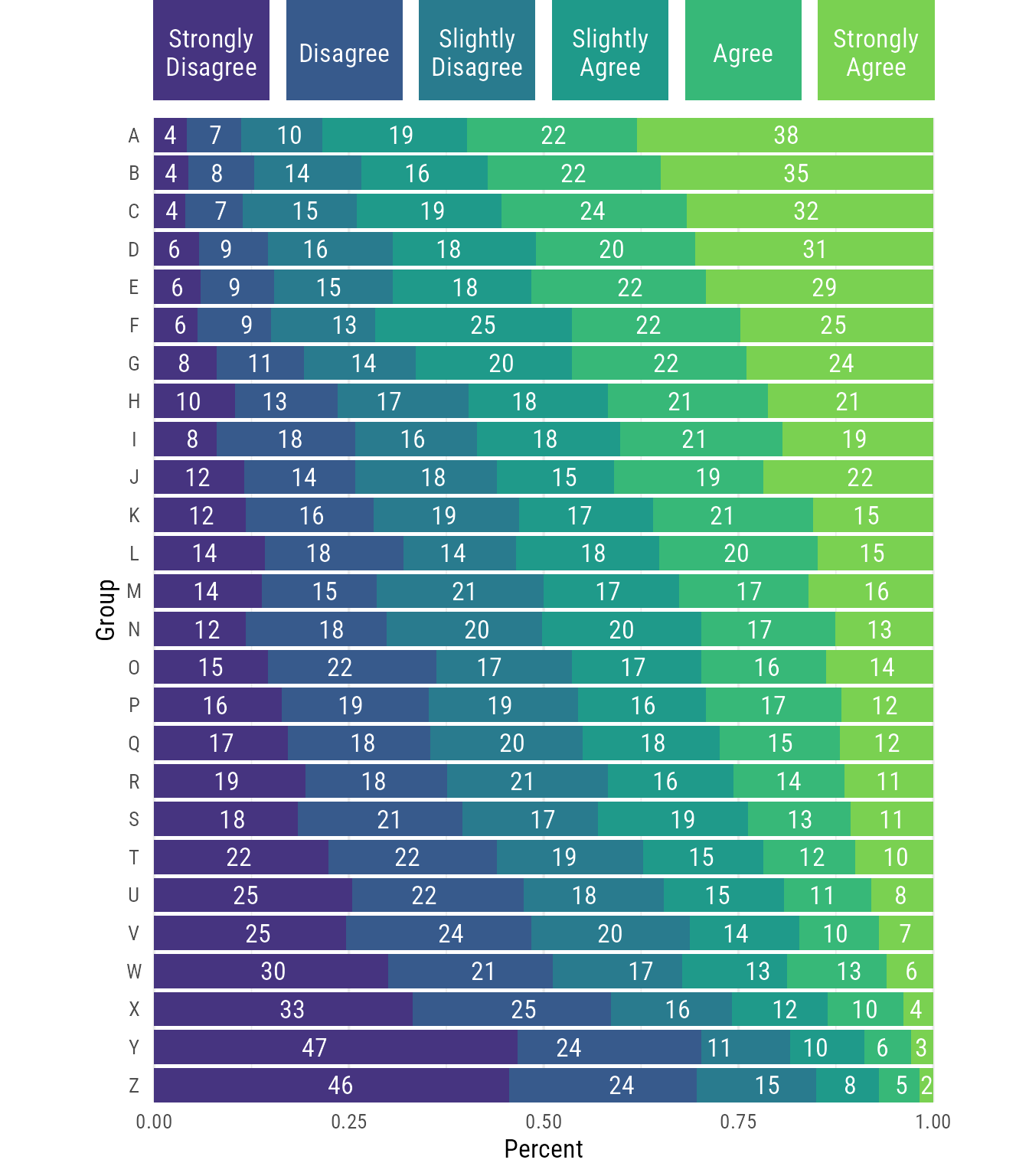
This feels right to me.
Citation
BibTeX citation:
@misc{schneider2021,
  author = {Schneider, W. Joel},
  title = {Bar Chart Labels on Smooth Paths in Ggplot2},
  date = {2021-07-31},
  url = {https://wjschne.github.io/posts/bar-chart-labels-on-smooth-paths-in-ggplot2/},
  langid = {en}
}
For attribution, please cite this work as:
Schneider, W. J. (2021, July 31). Bar chart labels on smooth paths in
ggplot2. Schneirographs. https://wjschne.github.io/posts/bar-chart-labels-on-smooth-paths-in-ggplot2/