
myfile <- "annotatedequationsimple"
Note
The xdvir package, which inserts \LaTeX equations into grid-based plots (including ggplot2) is now on CRAN. I recommend xdvir over the older methods presented in this post. Other than this message, I have left this post “as is.”
R has a mathematical annotation system via plotmath, but I like the look of true \LaTeX equations better.
Getting \LaTeX equations into ggplot2 plots has never been easy. The tikzdevice package is great if you are generating a .pdf document. If you are not, then you might want to consider other options.
The easiest, hassle-free option that I know of is to create the equation in a \TeX editor and then import the resulting .pdf using ggimage. If I need the best possible image quality, I convert the .pdf to .svg using dvisvgm (see example below).
For annotated equations, I like using the aptly-named annotate-equations \LaTeX package. It uses tikz to remember where parts of equations are on the page. The \eqnmark and \eqnmarkbox functions work like so:
\eqnmark[color]{node_name}{latex equation terms}
Then use the \annotate function like so:
\annotate[color]{above,left}{node_name}{annotation text}
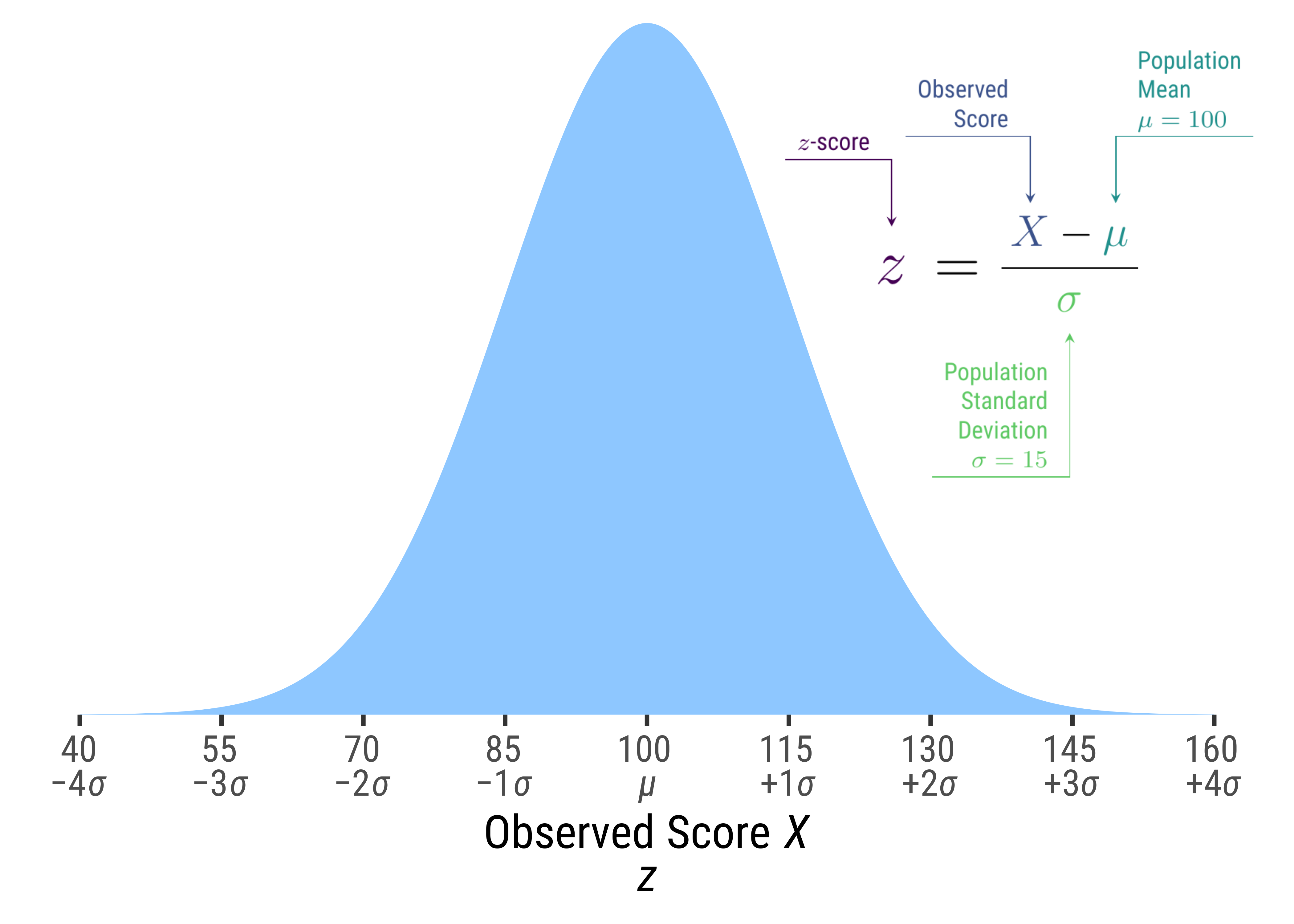
My Annotated Equation
I am going to refer to the same file name with various endings (e.g., .tex, .pdf, .svg), so I will define it here.
Here is the code for the annotated equation. It is saved in annotatedequationsimple.tex.
LaTeX code
```{tikz zscorecode}
%| code-fold: show
%| code-summary: "LaTeX code"
%| eval: false

\documentclass[border={25pt 50pt -35pt 52pt}]{standalone}
%\documentclass{article}
\usepackage{annotate-equations}
\usepackage{xcolor}
\definecolor{myviolet}{HTML}{440154}
\definecolor{myblue}{HTML}{3B528B}
\definecolor{myindigo}{HTML}{21908C}
\definecolor{mygreen}{HTML}{5DC863}
\usepackage[sfdefault,condensed]{roboto}
\begin{document}

\renewcommand{\eqnhighlightheight}{\mathstrut}

\huge$
\eqnmark[myviolet]{z}{z} =
\frac{
    \eqnmark[myblue]{x}{X}-
    \eqnmark[myindigo]{mu}{\mu}}{
    \eqnmark[mygreen]{sigma}{\sigma}}
$


\annotate[
    yshift=1em,
    myviolet,
    align=right]
    {above, left}
    {z}
    {$z$-score}

\annotate[
    yshift=1em,
    myblue,
    align=right]
    {above,left}
    {x}
    {Observed\\ Score}


\annotate[
    yshift=1em,
    myindigo]
    {above,right}
    {mu}
    {Population\\ Mean\\ $\mu = 100$}


\annotate[
    yshift=-.4em,
    mygreen,
    align=right]
    {below,left}
    {sigma}
    {Population\\ Standard\\ Deviation\\ $\sigma = 15$}

\end{document}

```
Now convert the .tex file to .pdf:
paste0('pdflatex -interaction=nonstopmode ', myfile,'.tex') |>
  shell()
Now we can convert the .pdf to .svg:
paste0("dvisvgm --pdf --output=", myfile,".svg ", myfile,".pdf") |>
  shell()
For best image quality, import the .svg file with svgparser. The read_svg function will create a grid grob that can plotted directly using ggplot2::annotation_custom.
In the simplest case, we can do this:
library(svgparser)
my_svg <- svgparser::read_svg(paste0(myfile, ".svg"))
ggplot() +
  theme_void() +
annotation_custom(my_svg, xmin = 0, xmax = 1, ymin = 0, ymax = 1) 
However, this is no better than just displaying the .svg directly. You probably want to embed the equation in a plot. For example:
Code
mu <- 100
sigma <- 15
plot_height <- dnorm(mu, mu, sigma)
lb <- -4 * sigma + mu
ub <- 4 * sigma + mu
ggplot() +
annotation_custom(my_svg,
xmin = 112,
xmax = 164,
ymin = .33 * plot_height) +
stat_function(
fun = \(x) dnorm(x, mean = mu, sd = sigma),
geom = "area",
n = 1000,
fill = "dodgerblue",
alpha = .5
) +
theme_classic(base_family = "Roboto Condensed",
base_size = 18) +
theme(
axis.text.x = element_markdown(),
axis.title.x = element_markdown(),
axis.line = element_blank()
) +
scale_x_continuous(
"Observed Score *X*<br>*z*",
breaks = seq(lb, ub, sigma),
limits = c(lb, ub),
labels = \(x) paste0(
signs::signs(x),
"<br>",
ifelse(
x == mu,
"<em>μ</em>",
paste0(
signs::signs((x - mu) / sigma,
add_plusses = T,
label_at_zero = "none"
),
"<em>σ</em>"
)
)
)
) +
scale_y_continuous(
NULL,
limits = c(0, plot_height),
expand = expansion(),
breaks = NULL
) 
annotation_custom.
If you can live with just a little pixelation, the ggimage package can import a .pdf directly with good results and less hassle, provided you render the plot with the ragg package.
Code
ggplot() +
geom_image(
data = tibble(
x = 140,
y = .65 * plot_height,
image = "annotatedequationsimple.pdf"
),
aes(x, y, image = image),
size = .70
) +
stat_function(
fun = \(x) dnorm(x, mean = mu, sd = sigma),
geom = "area",
n = 1000,
fill = "dodgerblue",
alpha = .5
) +
theme_classic(base_family = "Roboto Condensed",
base_size = 18) +
theme(
axis.text.x = element_markdown(),
axis.title.x = element_markdown(),
axis.line = element_blank()
) +
scale_x_continuous(
"Observed Score *X*<br>*z*",
breaks = seq(lb, ub, sigma),
limits = c(lb, ub),
labels = \(x) paste0(
signs::signs(x),
"<br>",
ifelse(
x == mu,
"<em>μ</em>",
paste0(
signs::signs((x - mu) / sigma,
add_plusses = T,
label_at_zero = "none"
),
"<em>σ</em>"
)
)
)
) +
scale_y_continuous(
NULL,
limits = c(0, plot_height),
expand = expansion(),
breaks = NULL
)
ggimage::geom_image.
A more complex example
In this example, I used the \eqnmarkbox function for greater clarity. The .tex file is saved in a file called annotatedequation.tex.
LaTeX code
\documentclass[border={10pt 48pt -45pt 62pt}]{standalone}
%\documentclass{article}
\usepackage{annotate-equations}
\usepackage{xcolor}
\definecolor{myviolet}{HTML}{414487}
\definecolor{myblue}{HTML}{2F6C8E}
\definecolor{myblue2}{HTML}{21908C}
\definecolor{mygreen}{HTML}{2FB47C}
\definecolor{mygreen2}{HTML}{7AD151}
\usepackage[sfdefault,condensed]{roboto}
\begin{document}

\renewcommand{\eqnhighlightheight}{\mathstrut}

$\LARGE
\eqnmarkbox[myviolet]{nodeP}{P\left(T \le \tau \right)} =
\eqnmarkbox[myblue]{phi}{\Phi}
\left(\frac{
    \eqnmarkbox[myblue2]{tau}{\tau}-
    \eqnmarkbox[mygreen]{esttrue}{\hat{T}}}{
    \eqnmarkbox[mygreen2]{sigma}{\sigma_{T - \hat{T}}}}
\right)$


\annotate[
    yshift=1em,
    xshift=11mm,
    myviolet]
    {above, left}
    {nodeP}
    {Probability true score $T$\\ is less than threshold $\tau$ }

\annotate[
    yshift=-.6em,
    myblue]
    {below,left}
    {phi}
    {Standard Normal Cumulative\\ Distribution Function $\Phi()$}

\annotate[
    yshift=1.4em,
    xshift=4mm,
    myblue2]
    {above,left}
    {tau}
    {Threshold $\tau=70$}

\annotate[
    yshift=3em,
    xshift=7mm,
    mygreen]
    {above,left}
    {esttrue}
    {Estimated True Score $\hat{T}=r_{XX}(X-\mu)+\mu$\\
    Observed Score $X\sim \mathcal{N}\left(\mu = 100, \sigma=15\right)$\\
    Reliability Coefficient $r_{XX}=\{.80,.85,.90,.95,.98\}$}

\annotate[
    yshift=-2em,
    mygreen2]
    {below,left}
    {sigma}
    {Standard Error of the Estimate\\
    $\sigma_{T-\hat{T}}=\sigma\sqrt{r_{XX}-r_{XX}^2}$}

\end{document}
Now convert .tex to .pdf:
Code
myfile <- "annotatedequation"

paste0('pdflatex -interaction=nonstopmode ', myfile,'.tex') |>
  shell()
And we are ready to plot. This plot shows the probability that an observed score will have a true score less than a specific threshold, given a reliability coefficient.
Code
viridis_start <- .2
viridis_end <- .8
threshold <- 70

# Find where a line intersects with the normal cdf
find_x <- function(rxx = .8,
                   slope = 0.0048,
                   intercept = .66,
                   mu = 100,
                   sigma = 15,
                   start_x = 60,
                   threshold = 70) {
  x <- start_x
  precision <- .00001
  diff_y <- precision * 10
  reps <- 0
  while (abs(diff_y) > precision) {
    x <- x - diff_y
    line_y <- x * slope + intercept
    curve_y <- pnorm(threshold,
                     mean = rxx * (x - mu) + mu,
                     sd = sigma * sqrt(rxx - rxx ^ 2))

    line_y <- x * slope + intercept
    curve_y <- pnorm(threshold,
                     mean = rxx * (x - mu) + mu,
                     sd = sigma * sqrt(rxx - rxx ^ 2))
    diff_y <- line_y - curve_y
    reps <- reps + 1
  }
  tibble(x = x, p = line_y, mu = mu, sigma = sigma, threshold = threshold, reps = reps)
}


dimage = data.frame(x = 115,
                    y = .62,
                    image = paste0(myfile, ".pdf"))
v_rxx <- round(c(seq(0.80, 0.95, 0.05), 0.98), 2)

d_threshold <-
  crossing(x = round(seq(40, 160, 0.1), 1),
           rxx = v_rxx,
           threshold = 70) %>%
  mutate(
    see = 15 * sqrt(rxx - rxx ^ 2),
    mu = (x - 100) * rxx + 100,
    p = pnorm(threshold, mu, see)
  ) %>%
  group_by(rxx) %>%
  mutate(acceleration = p - lag(p)) %>%
  ungroup


d_labels <- tibble(rxx = v_rxx) %>%
  mutate(x = map_df(rxx, find_x)) |>
  unnest(x)

d_threshold %>%
  ggplot(aes(x, p)) +
  geom_line(aes(color = factor(rxx)), lwd = 1) +
  geom_vline(
    aes(xintercept = threshold),
    lty = 2,
    lwd = 1,
    color = "gray30"
  ) +
  geom_image(data = dimage,
             aes(x = x,
                 y = y,
                 image = image),
             size = .87) +
  geom_richtext(
    aes(label = rxx_label,
        color = factor(rxx)),
    data = d_labels %>%
      mutate(rxx_label = prob_label(rxx)),
    angle = -67,
    size = WJSmisc::ggtext_size(13),
    label.colour = NA,
    fill = "#FFFFFF",
    family = "Roboto Condensed",
    label.margin = unit(0, "mm"),
    label.r = unit(2, "mm"),
    label.padding = unit(c(0, 0.75, 0, .5), "mm")
  ) +
  scale_x_continuous(
    "Observed Score",
    breaks = seq(40, 160, 15),
    minor_breaks = seq(40, 160, 5),
    expand = expansion()
  ) +
  scale_y_continuous(
    paste0("Probability True Score < ", threshold),
    expand = expansion(),
    breaks = seq(0, 1, 0.1),
    labels = prob_label,
    limits = c(0, 1)
  ) +
  scale_color_viridis_d(begin = viridis_start,
                        end = viridis_end) +
  theme_minimal(base_family = "Roboto Condensed",
                base_size = 16) +
  theme(legend.position = "none",
        plot.margin = unit(c(3, 5, 2, 2), "mm")) +
  coord_fixed(ratio = 100,
              clip = "off",
xlim = c(40, 160)) 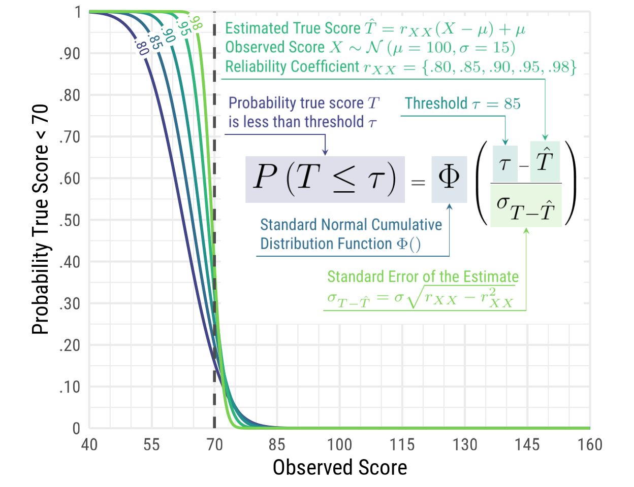
Citation
BibTeX citation:
@misc{schneider2023,
  author = {Schneider, W. Joel},
  title = {Annotated Equations in Ggplot2},
  date = {2023-07-24},
  url = {https://wjschne.github.io/posts/2023-07-23-latex-equation-in-ggplot2/},
  langid = {en}
}
For attribution, please cite this work as:
Schneider, W. J. (2023, July 24). Annotated equations in ggplot2.
Schneirographs. https://wjschne.github.io/posts/2023-07-23-latex-equation-in-ggplot2/