
library(tidyverse)
p <- ggplot() +
  stat_function(xlim = c(-4,4), fun = dnorm, n = 801) +
  labs(x = "z-scores", caption = "Note: Mean = 0, SD = 1")

p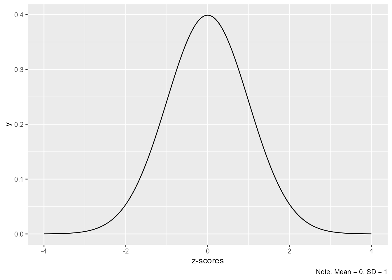
Sometimes I want to put a plot caption in the lower right corner of the plot.
library(tidyverse)
p <- ggplot() +
stat_function(xlim = c(-4,4), fun = dnorm, n = 801) +
labs(x = "z-scores", caption = "Note: Mean = 0, SD = 1")
p
However, I want the caption to be a little higher, on the same line as the x-axis title. To do so, set a a negative top margin:
p + theme(plot.caption = element_text(margin = margin(t = -10, unit = "pt")))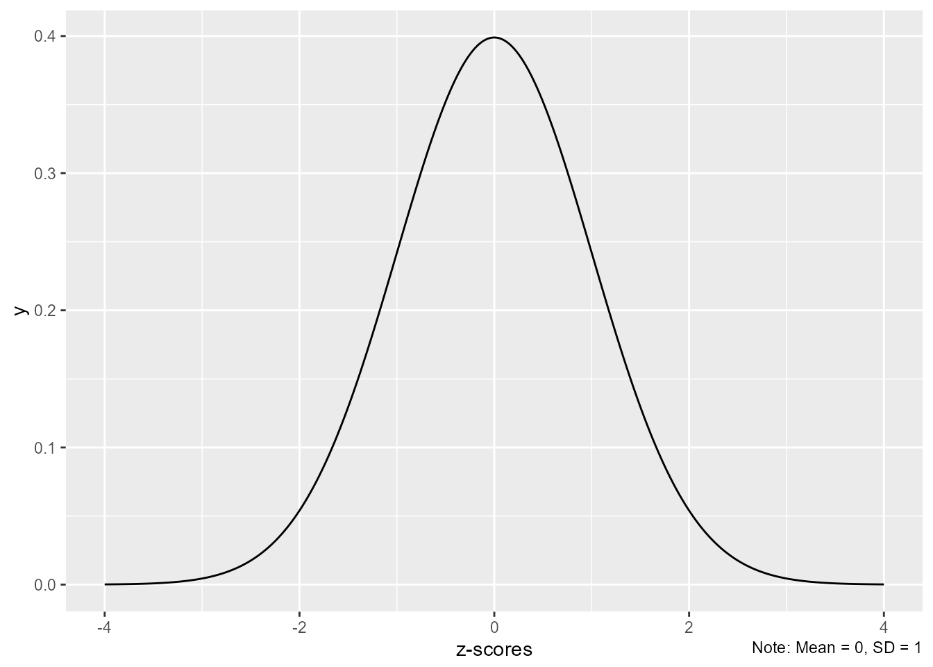
Here is a more finished example.
library(ggnormalviolin)
library(ggtext)
my_font_size = 16
my_font <- "Roboto Condensed"
update_geom_defaults(geom = "text",new = list(family = my_font) )
update_geom_defaults(geom = "label",new = list(family = my_font) )
update_geom_defaults("richtext", list(family = my_font))
theme_set(theme_minimal(base_size = my_font_size, base_family = my_font, ))

d_rect <- tibble(SS = 100,
                 width = c(20, 40, 60, 80, 122),
                 fill = paste0("gray", c(95, 90, 80, 70, 65) - 25)) %>%
  arrange(-width)

tibble(
  Scale = c(
    "Fluid Reasoning",
    "Verbal Comprehension",
    "Visual-Spatial Processing",
    "Working Memory",
    "Processing Speed",
    "Population"),
  y = c(5:1 - 0.4, 0),
  SS = c(115, 111, 109, 86, 79, 100),
  rxx = c(.93, .92, .92, .92, .88, 0),
  width = c(rep(1.4, 5), 10.6),
  alpha = c(rep(1, 5), .3)
) %>%
  mutate(true_hat = rxx * (SS - 100) + 100,
         see = ifelse(rxx == 0, 15, 15 * sqrt(rxx - rxx ^ 2)),
         Scale = fct_inorder(Scale) %>% fct_rev()) %>%
  ggplot(aes(y, SS)) +
  geom_tile(data = d_rect, aes(width = 6, x = 3,
                               fill = fill,
                               height = width,
                               y = SS)) +
  geom_normalviolin(aes(mu = true_hat,
                                        sigma = see,
                                        width = width,
                                        alpha = alpha),
                                    face_left = F,
                    fill = "white") +
  geom_richtext(aes(label = ifelse(
    Scale == "Population",
    "Population Mean",
    paste0("<span style='font-size:8.5pt;color:white'>(",
           round(100 * pnorm(SS, 100, 15),0),
           ") </span>",
           SS,
           "<span style='font-size:9pt;color:#666666'> (",
           round(100 * pnorm(SS, 100, 15),0),
           ")</span>"))),
    vjust = -0.5,
    lineheight = .8,
    fill = NA,
    color = "gray20",
    label.color = NA,
    label.padding = unit(0,"mm")) +
  geom_text(aes(y = true_hat,
                label = ifelse(Scale == "Population",
                               "",
                               as.character(Scale))),
            vjust = 1.65,
            color = "gray15",
            lineheight = .8,
            size = 12.5,
            size.unit = "pt") +
  geom_linerange(aes(ymin = true_hat - 1.96 * see,
                      ymax = true_hat + 1.96 * see),
                 linewidth = .5) +
  geom_pointrange(aes(ymin = true_hat - see,
                      ymax = true_hat + see),
                  size = .65,
                  linewidth = 1.75) +
  geom_text(aes(x = x, y = y, label = label),
            data = tibble(
              y = c(49.5, 65, 75, 85, 100, 115, 125, 135, 150.5),
              x = 5.65,
              label = c("Extremely\nLow Range",
                                  "Very\nLow",
                                  "Low\nRange",
                                  "Low\nAverage",
                                  "Average\nRange",
                                  "High\nAverage",
                                  "High\nRange",
                                  "Very\nHigh",
                                  "Extremely\nHigh Range")),
            color = "white", lineheight = .8, size = 4.25) +
  scale_y_continuous(
    "Standard Scores <span style='font-size:11.7pt;color:#656565'><br>
    (and Percentile Ranks)</span>",
    breaks = seq(40, 160, 10),
    limits = c(37, 163),
    labels = \(x) paste0(x,
                         "<br><span style='font-size:10pt;color:#656565'>(",
                         pnorm(x,100, 15) %>%
                           WJSmisc::proportion2percentile(digits = 2) %>%
                           str_trim(),
                         ")</span>"),
    expand = expansion()) +
  scale_x_continuous(NULL, expand = expansion(), breaks = NULL) +
  scale_alpha_identity() +
  scale_fill_identity() +
  coord_flip(clip = "off") +
  theme(axis.title.x = element_markdown(hjust = 0,
                                        margin = margin(t = 1.25,
                                                        l = 2,
                                                        unit = "mm")),
        axis.text = element_markdown(),
        axis.text.x.bottom = element_markdown(colour = "gray20"),
        plot.caption = element_markdown(hjust = 0,
                                        size = 10,
                                        margin = margin(t = -10.25,
                                                        l = 100,
                                                        unit = "mm"),
                                        color = "gray40"),
        plot.title = element_text(hjust = .025)) +
  labs(
    title = "Display of Cognitive Test Scores",
    caption = "**Notes:** The white normal curves represent the expected
       true<br>score distributions for each observed score. The black lines<br>
       underneath span the 68% and 95% confidence intervals.")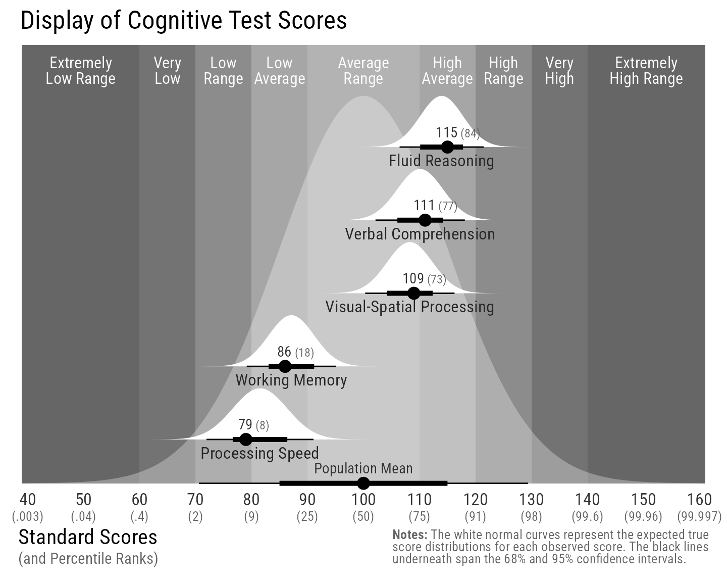
@misc{schneider2021,
  author = {Schneider, W. Joel},
  title = {Caption on Same Line as Axis Title in Ggplot2},
  date = {2021-07-21},
  url = {https://wjschne.github.io/posts/caption-on-same-line-as-axis-title-in-ggplot2/},
  langid = {en}
}